
There is a lot to consider when finding an image to use for your website. Beyond the obvious subject matter of the image, you also want to ensure the image fits with the styling of the web page it will be used on and has similar overall appearance to keep things consistent across the entire website.
Professional Photography
Your best option for images on your website is to get a professional photographer to take them. While it can get expensive, it does give your website a more professional look which can turn more website visitors into potential customers. Images from a professional photographer has an up front cost but you will come out ahead in the long run by the increase in the number of customers.
DIY Photography
Your next best option is to do your own photography. Smart phone camera’s have come a long way and if you have a semblance of how to take decent photos, this can work. It also gives the website a more personal feel since the actual business is represented in real life as compared to stock photos and their generic feel.
Stock Photos
Your last option is Stock Photo Websites. There are some free options like Unsplash but they will not have the selection paid stock photo website like Envato will have. Free stock photo websites also may have different licenses requiring images downloaded to only be used on personal websites or require an attribution.
Copyright Considerations
Never download and use images directly from other websites or a Google search. Most of these images are copyrighted and require proper licensing. Unauthorized use can result in legal issues, including demands for compensation from image owners.
Aspect Ratio
When choosing an image for your website the aspect ratio of the image has to be considered. Aspect ratio refers to the proportional relationship between the width and height of an image. It is expressed as width:height (e.g., 16:9, 4:3, or 1:1). For example, most laptop and TV screens have an aspect ratio of 16:9.
Choosing the Right Aspect Ratio
Depending on where the image will be used you need to choose an appropriate aspect ratio for it. This needs to be considered from the point of view of a visitor using the website on a device with a larger screen as those more often need an image that is wider than it is tall.
For websites you don’t need to worry about what is the exact ratio you need for an image since this is impossible to do with website pages being responsive (layouts and content respond to the viewport size). Your main concern should be does it need an image with a landscape or portrait orientation.
What are Landscape and Portrait Images?
The difference between landscape and portrait images is based on their orientation (width vs. height ratio):
- Landscape Orientation
The image is wider than it is tall (width > height). Common landscape aspect ratios include 16:9, 4:3, and 3:2. - Portrait Orientation
The image is taller than it is wide (height > width). Common portrait aspect rations include 9:16, 3:4, and 2:3.

Best Formats for Images
The most common format now days is JPEG (Joint Photographic Expert Group Image, also called JPG). You can tell the format of an image is by the file extension it uses. JPEG is an older technology, but it is supported by all modern browsers unlike some of newer technologies that have more features and better compression. Most phones and camera’s use this as their default when saving photos.
The common complaints of JPEG image format is the lack of support for transparencies and the inability to display animations.
When transparencies are needed in an image then PNG (Portable Network Graphics) file format can be used. PNGs also have a more precise reproduction of the source image, but this comes at a cost of larger file sizes.
If short animations are needed (like Memes) then GIFs (Graphics Interchange Format) are usually used. This is an extremely old format and is widely supported but lacks good compression.
A newer file format called WebP (Web Picture Format) now has universal support by all modern browsers. Introduced in 2010 WebP offers support for transparencies and animations. It also offers slightly better compression than JPEG at a similar image quality level. This means on a modern website, all the older image formats mentioned above (JPG, PNG, GIF) can be replaced by this one file format.
Another newer competing image format is AVIF (AV1 Image File Format). It offers similar benefits as WebP but uses a more efficient compression technology that allows for smaller files sizes with similar image quality as WebP. Like WebP, AVIF is designed for storing image sequences as well allowing for short animations or video clips. The downside to AVIF is it is not as well supported yet as WebP in modern browsers.
While both WebP and AVIF are becoming more popular they are not supported in older browsers which are still used by a certain small percentage of visitors (which is decreasing every year). As of late 2024 Can I Use reports WebP support at 97% and AVIF support at 94%. Therefore, it is recommended that if you use these newer file formats you may want to include fallbacks for images in older file formats like JPEG which have better browser support.
The final file format we will look at is SVG (Scalable Vector Graphics). This is a vector image format which uses XML text format and coordinates to describe how the image should appear. For this reason, the image can be scaled without loss of quality. It does not depend on resolution which means the file size remains the same no matter how large the image is making it ideal for user interfaces, icons and logos.
For a more comprehensive look check out the Morzilla Image File Type and Format Guide.
Image Formats Summary
Common Image Formats
- JPEG (JPG): The most widely used format, supported by all modern browsers. It offers good compression but lacks support for transparency and animation.
- PNG: Supports transparency and provides higher image quality, but results in larger file sizes.
- GIF: Supports simple animations but has poor compression compared to modern formats.
Modern Image Formats
- WebP: Supported by all modern browsers, WebP offers transparency, animations, and better compression than JPEG.
- AVIF: A newer format with even better compression than WebP but with slightly less browser support.
- SVG: A vector format ideal for logos and icons, as it scales without loss of quality.
Compression
All the image formats we talked about so far except for SVG can be compressed.
There are two kinds of image compression, lossless and lossy. There are pros and cons to both compression methods. Just as it sounds, lossless compression means that the image is compressed without degrading the image’s visual quality where lossy permanently removes some of the original data.
Lossless compression usually only results in slight reduction in file size. Therefore, in almost all cases for displaying images on websites you will need to use lossy compression to reduce the file size to any great degree. This is a balancing act since lossy compression set at lower quality levels can affect the visual quality of the image significantly.

This is where a tool like Squoosh is ideal to use since you have a slider control and can see the image before and after the compression (and image resize). You also can change the file format of the image if you wish with the app.
There is no magic number for image quality that you can use. Some images which are simple and are not busy can be compressed much greater while still appearing to have a high quality. Other images that have a lot of different colours and are busy (like a crowd of people or a forest, etc.) will have to be set at a higher quality. Ideally a range between 40 and 75 will work but you will have to decide that yourself on a case-by-case basis.
For websites to keep performance high you want the smallest image file size (to reduce loading time of the page) while still retaining an acceptable visual quality for the image where compression artifacts (distortions or imperfections) of the image would not really be noticeable by a regular visitor to the website. Common compression artifacts that may be noticeable include blockiness, ringing (also called banding), or other edge busyness such as a shimmering blur of dots around edges, known as mosquito noise.
Resolution
Like with compression, all the image formats we talked about so far except for SVG have a specific image size or resolution.
The resolution of the image (the number of pixels of the width of the image and the height) is important to consider when preparing an image to be used on a website. Basically, a pixel is the smallest element that makes up the image. If you are interested to know more about pixels, we talked about them in greater detail in Why No Web Design is Pixel Perfect along with touching on resolutions and pixel densities.
Typically, the higher the resolution of the image, the larger the file size since usually more information needs to be stored. Larger files result in longer download times meaning the web page it is being used on takes longer to load and display.
Therefore, with websites to keep performance high, you want the smallest image file size while still retaining an acceptable resolution and visual quality for the image.
When you upload an image on a WordPress website it is best to upload the largest size of the image you think it could potentially be used for. Most websites have 2 potential max widths when dealing with content. This includes what we like to call at eSilverStrike Consulting “site width” and “content width”.
Site wide images go right across the entire website page including into the margins. This image touches each horizontal edges of the devices screen. An example of a section of a webpage that would use this type of image is a Hero as in many cases they tend to be site wide to stand out and offer maximum visual impact.
Content wide images are to be used only within the content area of the website. This content area contains any text copy and images and have a margin or gutter to make the material more readable and to prevent it from touching the sides of the screen.
Physical Screen Size VS Screen Resolution VS Viewport Resolution
To complicate things, your website and images can be viewed on many different devices that have different physical screen sizes, screen resolutions and viewport resolutions.
- Physical Screen Size
The actual, measured size of a screen, typically given in inches (e.g., 6.1″ for a smartphone or 24″ for a monitor). - Screen Resolution
The total number of pixels a screen can display, typically expressed as width × height (e.g., 1920×1080 or HD, 3840×2160 or 4K). - Viewport Resolution
The visible area of a device, measured in virtual pixels rather than physical pixels. It is affected by device scaling and zoom settings.
Best Resolutions to Upload
When you take everything into account, we found the best resolution to upload images are:
- Site Wide = 2400px
This should include only images with a landscape orientation. - Content Wide = 1500px
This also includes any images with a portrait orientation.
This is based on the most common screen and viewport resolutions used by a large majority of website visitors.
Yes, there are cases where these resolutions may not be the best for someone on an 8K or ultra wide monitor. but these visitors are few and far between and most likely most would have their viewport resolution set at a more reasonable setting for viewing.
It Doesn’t Make Sense to Load Large Images on Small Devices
If you are thinking this, you are correct. Loading a large resolution image on devices with smaller screens like mobile phones (especially with high-cost data plans) is a waste of bandwidth.
Internet Browsers do have a solution for this. A “srcset” (or Source Set) attribute is available for images allowing you to specify different images to be loaded depending on the viewport width of the screen.
WordPress makes this feature easy to handle. When uploading an image to the Media Library, WordPress automatically creates new versions of the same image at lower resolutions and a set compression level.
Wherever this image is displayed on the website WordPress will automatically use “srcset” and include all the sizes the image has improving the performance of your website on smaller screen devices.
Filename
Before uploading an image to your website, it is important to update the filename.
The filename should be all lower case and not contain any punctuation or spaces. Spaces should be represented by either the dash (-) or underscore (_). This is done to ensure maximum compatibility with a visitor’s internet browser and the websites server.
A filename should contain keywords that help describe the image and/or its most likely use case. If the image filename is similar to the text copy on the page it may get a slight Search Engine Optimization (SEO) boost from search engines. This also makes the image easier to identify and to search for in the WordPress Media Library.
Image Metadata (fields) in WordPress
After you upload images in WordPress, you can edit them in the media library.
When editing, there are tools available that allow you to crop, rotate (or flip), and scale the image. This type of image manipulation is best done before uploading the image as the tools WordPress provides are basic and may not give the best results.
You also have several input fields (or metadata) you can fill out. Some of these are filled out automatically based on the filename of the image.
After uploading the image, you should always update most of these fields. It is important for organization, SEO, and accessibility.
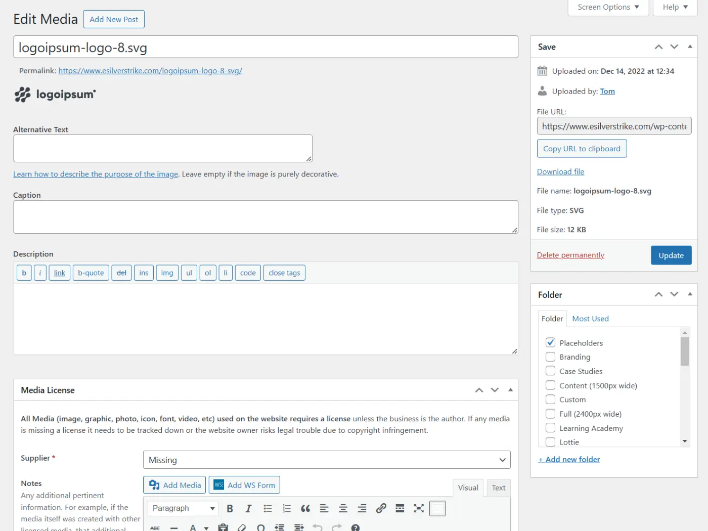
Title
The title of your image. This is required and makes the image easier to find when searching. If an Alternative Text has not been defined then this would become it’s default,
Alternative Text
Alternative Text (ALT Text) is a very important field and in most cases should be filled out. This field describes the purpose of the image for screen readers and SEO. The only time it doesn’t need to be used is if where the image is being displayed, it is for purely decorative reasons and adds no real value to the content of the page.
The ALT Text describes any text in the image and the purpose of the image. It doesn’t need to describe what the image is necessarily but the reasons why you choose the image and how it relates to the content around it.
Caption
This is the text that appears below the image when displayed on your site. This field is most used by images in blog posts or Image Galleries. If you don’t usually want text to display with the image you uploaded, then you can ignore this field.
Description
A longer description of the image that isn’t typically displayed but can be used for organizational purposes.
Media License
This group of fields are custom for clients of eSilverStrike Consulting. Depending on the supplier selected for the image the fields may change.
All Media (image, graphic, photo, icon, font, video, etc.) used on a website requires a license unless the website owner is the author. It is important to record the information here in case you are ever asked to prove you have a license to use the image.
WordPress Media Library Folders
eSilverStrike Consulting client websites come with a few extra features for the Media Library. This includes folders which allow you to categorize the images using a hierarchical folder structure. Images can be assigned to 1 or more folders.
It is always recommended to organize your images properly as it avoids a cluttered messy list where files are more difficult to locate. It also makes it smoother for multiple people to manage the library.
