

Pixel-perfect web design refers to the idea of creating a design that precisely matches the intended layout, spacing, and visual elements on a website, down to the pixel level. The initial mockup of a website (usually done in design tools like Figma or Penpot) matches 100% the final website build.
Achieving true pixel perfection in web design is not possible for many reasons:
What is a Pixel?
In simple terms, a pixel is the smallest addressable element in digital media or display device. It is one of the many small dots or squares that make up a media file like an image or screen on a device. In the 1960s the word pixel was formed from the words picture and element.
Device Differences
There is no standard measurement for a pixel. Different devices have varying screen sizes, resolutions, and pixel densities. Pixel units change relative to the size of the screen. A font that is 12 pixels tall (or 12px) is going to look different depending on whether it’s being displayed on a small screen of a phone or a larger screen on a laptop.
This also can be true of devices with the same sized screen. For example, laptops with the dimension of 14″. This number usually refers to the measurement of the screen diagonally going from the upper corner of the screen to the opposite bottom corner on the other side of the screen. While the physical screen is the same size across different laptops the screen resolution can differ. One screen may only be high definition which is 1920 x 1080 pixels, and another may be 4K which is 4096 x 2160 pixels (which is 4 times the number of pixels in the same space).
In a lot of cases on a laptop of this physical size, the owner may watch movies at full 4K resolution keeping a sharp image but have the user interface of the operating system, programs, and web browsers scale up, so text is easier to read and reducing eye strain. This means you actual can have multiple pixels making up a single simulated pixel in the scaled version of the user interface. The user interface is scaling to the resolution of the viewport and not what it is capable of.
The actual physical shape of a pixel from one device to the next can have different dimensions and aspect ratios. Some devices may have pixels that are close to being a square while others are rectangles. On some devices a pixel could be a similar size to a point of a regular sewing pin while on others it may be closer to the size of the point on a knitting needle. This is where the idea of pixel density comes in (i.e. Pixels Per Inch).
Resolution also just doesn’t refer to the device as the media assets like images and videos all have their own dimensions (resolution). When viewed on a web page these assets are all scaled based on the device resolution and the dimensions it is told to display at on the page.
Website Units of Measurement
Modern websites use Cascading Style Sheets (CSS) to help style web pages. CSS has many different units of measurements. Pixels is one of them but as mentioned above can be interrupted differently depending on the device screen size and how the viewport is set.
To ensure websites can be viewed on different devices and user preferences in a lot of cases other units like %, ch, em, and rem are used when building a website to specify the size.
Browser Differences
Websites are accessed using various browsers like Chrome, Firefox, Safari, and Edge. Each browser interprets HTML, CSS, and JavaScript differently in mostly minor ways. Factors like browser versions, and user settings can affect how a website appears.
Designers often have to make compromises or use browser-specific hacks to ensure a consistent appearance across different browsers.
Accessibility and User Preferences
Users can customize the operating system of their device and browsers to adjusting zoom level, font sizes, color schemes, and other settings. These custom user preferences will clash with the websites original design.
Accessibility standards often require flexible designs to accommodate users with disabilities, which can impact the precision of design layouts.
Responsive Design
Responsive design will automatically adjust the copy, media, and layout of the page to to automatically fit within any screen size. This prevents the zooming and scrolling that happens in a web browser when the website is viewed on smaller screens. More importantly when done correctly this keeps your:
- Copy readable and media viewable
- Website navigation working
- Features of the website functioning
All without the visitors having to make any adjustments.
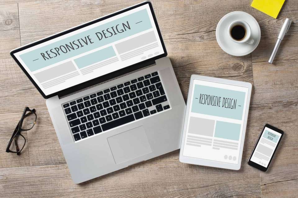
This is accomplished mainly in 2 ways by using breakpoints and scaling.
A breakpoint defines a screen size range. Within this size the layout of the page or sections can be adjusted to better fit the screen. Styling of elements (the building blocks of a webpage) can also change to help maintain the usability of the website. In general, a website usually defines 2 to 3 breakpoints (this generally targets phones, tablets, and laptops) to help it scale between the hundreds of different screen sizes found on devices people use to view websites.
Fluid scaling of fonts, and spacing (margins, padding, etc…) using calculations also contribute to responsive design. Instead of fonts and spacing staying the same for all screen sizes on the website (or within each breakpoint on the website) they are allowed to scale up or down depending on the exact size of the screen and its viewport settings. This approach reduces or eliminates the fine-tuning for specific breakpoints and keeps everything consistent.
Common changes you notice in responsive design as screen sizes shrink are
- Multi-column content like a card list of articles decreases the column count while increasing the row count.
- Sections of content which are laid out horizontally may change to a vertical layout at a certain breakpoint. This is called stacking.
- The width of the copy usually decreases as the space does resulting in more lines of text which also pushes other content down. This can happen as well with fluid typography and spacing. Fonts tend to increase in size on smaller screens while spacing like padding and margins decrease in size.
- Media tends to shrink in dimensions until layouts start to stack.
Dynamic Content
Most website design mockups are created early in the project when the copy for the website is not complete or even started. This means that the mockup most likely contains, at least in part, dummy copy and media that will not be part of the final website but is just in place to show the approximate size of the content area.
The length of the final copy for the different sections of the website never matches 100 percent the length of the mockup copy. This means that page elements like headings and paragraphs in the final copy may not contain the same number of lines of text as the mockup copy. This will either enlarge or shrink the area it resides in which can also lead to in other areas of the page, automatic layout adjustments. This is also true for the number of paragraphs in a section of copy or other copy elements like lists.
In Conclusion
In todays world pixel-perfect website designs are just not possible. It is crucial for designers and developers to prioritize adaptability and responsiveness to ensure a positive user experience across a diverse range of devices and conditions. Embracing flexibility and understanding the inherent variability in the web environment is one of the keys to successful web design.
